Dive Brief:
- PepsiCo unveiled its first new corporate brand identity in nearly 25 years to better emphasize the breadth and diversity of its global food and beverage portfolio, according to a press release.
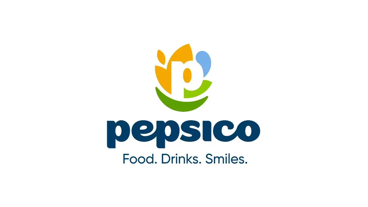
- Central to the updated logo is a white “P” surrounded by an earthy orange symbol for food and grain, a blue drop of water and a leaf-like green shape symbolizing the Pep+ sustainability program. The iconography sits above a deeper green slash representing a smile tied to PepsiCo’s new tagline: “Food. Drinks. Smiles.”
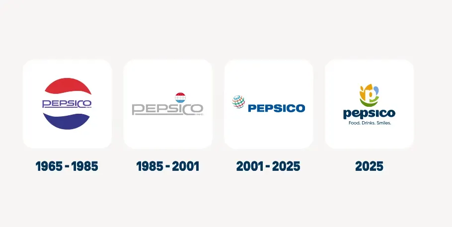
- The changes mark a break from past PepsiCo visual identities, which have hewn closer to the branding for flagship soda Pepsi. The Quaker and Frito-Lay owner is getting a makeover as it comes under greater pressure to shake up the business amid growth struggles.
Dive Insight:
PepsiCo’s rebrand introduces a lot of changes, but one immediately noticeable aspect of the overhaul is the attempt to shift emphasis away from Pepsi. Prior PepsiCo logos have echoed the marketer’s flagship soda brand, with blue-and-red color schemes and different iterations of the beverage’s signature globe icon. Those elements are mostly absent from the latest update, which instead puts equal emphasis on food and grains, drinks and water and the Pep+ sustainability program, all underscored by a smile.
In the announcement, PepsiCo noted that only 21% of consumers can identify a brand under its umbrella that isn’t Pepsi, signaling an awareness problem for a company that owns over 500 brands. PepsiCo’s previous logo, which shows an all-caps, bold blue “PEPSICO” sitting under a globe, was implemented in 2001.
“Our new identity boldly reflects who we are in 2025: a company with expansive reach, aiming for positive impact across the globe and an unmatched family of beloved food and drink brands,” said PepsiCo CEO Ramon Laguarta in a press statement.
The color palette of the new identity is rooted in the “real world,” with earthier, more muted tones, while a custom typeface is done in lowercase letters to convey approachability, according to PepsiCo. The focus on smiles is meant to signal PepsiCo’s “obsession with consumers,” which the company wants to reach during more occasions, said Jane Wakely, chief consumer and marketing officer and chief growth officer of PepsiCo International Foods, in the announcement.
PepsiCo’s refreshed look will begin appearing on packaging early next year, Wakely said, and phased in over time to different markets. It is already present on the marketer’s social media and digital channels, including the PepsiCo corporate website.
In an open letter, Laguarta went into greater detail on some of the initiatives the rebrand will help reinforce, including propping up high-growth brands like Lay’s and Tostitos; stripping artificial ingredients and colors out of products like Doritos and Gatorade (in a response to the Make America Healthy Again movement); and repositioning brands for different occasions and to reach consumers through new channels, including away from home. Internally, PepsiCo has been streamlining operations and investing more in artificial intelligence for “precision and impact.”
Laguarta has been under pressure to shake things up amid declining sales and market share for some of PepsiCo’s brands. Activist investor Elliott Investment Management in September took out a nearly $4 billion stake in PepsiCo with the goal of getting the food and beverage giant to shed low-performing offerings and revamp aspects of its bottling network.
The full-sugar, or blue can, variant of Pepsi has dropped from No. 2 by volume in the U.S. to fourth place in just a few years’ time, per Beverage Digest data. PepsiCo earlier this year acquired Poppi, a disruptor in the booming prebiotic soda space, for nearly $2 billion. The better-for-you brand received a callout in the corporate rebranding announcement, as did Mexican-American food label Siete, another recent acquisition.